Accounting in Order was born from a different vision: accounting not as a requirement… but as a strategic tool.
It’s not just about recording or complying, but about understanding, organizing, and planning.
About transforming numbers into something meaningful. Something that guides. Something that provides support.
The line in the logo represents that process.
It’s not a perfect graphic, because no business is. It has rhythm, it evolves… but it always maintains direction.
Each point reflects a stage: organizing, understanding, making decisions… and moving forward.
The final arrow isn’t a closure, it’s an opening: it speaks of intentional growth, structured evolution, and moving forward with a clear destination in mind.
This logo doesn’t seek to impose, it seeks to support.
It speaks of a brand that organizes without complicating, that guides without overwhelming, and that transforms information into clarity.
Because when everything is in order, decisions flow more easily.
Brand Guidelines
This document defines the conceptual language, strategic direction, and visual principles that build a strong, coherent, and high-value brand identity.
At its core, the brand is founded on trust, clarity, and strategic vision, projecting itself not only as an accounting service but also as a key partner in protecting, organizing, and growing its clients’ wealth. Each concept developed responds to a clear intention: to elevate the perception toward a more exclusive, human, and results-oriented positioning.
These guidelines establish the foundations that guide its visual and communicative expression, encompassing everything from color choices, typography, and graphic resources to how the brand conveys security, approachability, and evolution.
Whether in digital environments, printed materials, or brand experiences, these principles ensure that every touchpoint reflects coherence, authority, and a distinctive balance between technical precision and human warmth.
Contents
01 Brand Strategy
Contabilidad en Orden
In the world of business, financial disorder is more dangerous than it seems—hidden errors, lack of structure, and unclear numbers silently limit growth and drain profitability. Companies don’t fail because they lack revenue, but because they lack clarity, control, and strategic direction.
Contabilidad en Orden exists to change that.
Built on the belief that organized finances create powerful businesses, the brand goes beyond traditional accounting. It positions itself as a strategic partner—one that protects, guides, and transforms the financial reality of each client.
At its core, Contabilidad en Orden delivers more than reports; it delivers peace of mind. By combining structured processes, advanced technology, and human expertise, it brings clarity to complexity, turning financial chaos into confident decision-making.
The brand stands out not only for its precision, but for how it makes clients feel:
secure, supported, and in control.
It operates at the intersection of three powerful forces:
Protection (The Protective Partner)
A solid and reliable presence that safeguards the client’s financial health. Every number is reviewed with rigor, creating a barrier between the business and costly mistakes. Trust and authority are non-negotiable.
Strategy (The Strategic Pilot)
Not just managing numbers, but driving growth. Through technology, efficiency, and forward-thinking insights, the brand helps businesses scale with structure and clarity. It transforms accounting into a tool for expansion.
Human Connection (The Human Accountant)
Behind every number, there is a story—and the brand understands it. With a clear, approachable, and empathetic communication style, it translates complexity into simplicity, making clients feel understood and empowered.
At Contabilidad en Orden, the mission is simple yet powerful:
to bring order, clarity, and confidence to every financial decision.
Because when the numbers are clear,
the business grows with certainty.
02 Personality
Contabilidad en Orden
defines itself as a brand that integrates technical expertise, strategic vision, and a human touch to transform how companies understand and manage their finances. Its approach transcends the traditional role of the accountant, positioning itself as a strategic partner that protects, guides, and provides clarity in every financial decision.
Its personality is solid, structured, and reliable, while remaining accessible, clear, and empathetic. It has the ability to translate complexity into simplicity, to transform disorder into control, and uncertainty into peace of mind.
It communicates firmly, avoiding rigidity;
explains precisely, without overwhelming;
and provides insightful support, going beyond simply delivering data.
As a brand, it is characterized by:
Protecting its clients’ assets through rigorous processes and meticulous attention to detail.
Guiding decision-making through a strategic vision focused on sustainable growth.
Simplifying financial information, making it understandable and actionable. Connecting through empathy, building trust through a warm and personal approach.
Their communication style is direct, professional, and transparent, always maintaining a balance between technical precision and a friendly touch.
Innovation
Efficiency
Collaboration
Quality
Results
Tone & Voice
Our Vision: why we exist
To bring clarity, order, and confidence to every financial reality, transforming accounting into a strategic tool that empowers businesses to grow with certainty and control.
Our Promise: how we help
To deliver structured, precise, and forward-thinking accounting solutions that eliminate errors, optimize financial performance, and provide clients with clear, actionable insights for smarter decision-making.
Our Promise: how we help
To guide every client with transparency, expertise, and a human approach—ensuring their finances are protected, understood, and aligned with their long-term goals, while delivering a seamless and stress-free experience.
Sample Copy
Built on Protection, Driven by Strategy
Every business deserves more than bookkeeping—it deserves protection. At Accounting in Order, we act as a strategic shield between your finances and costly mistakes. With clarity and structure, we safeguard your growth so you can operate with total peace of mind.
We Guide Every Step, You Scale with Confidence
We don’t just manage numbers—we engineer systems. Through organized processes, constant communication, and smart technology, we turn your financial operations into a streamlined machine. You stay focused on growth while we handle the complexity behind the scenes.
Clarity Over Complexity — Always
We believe numbers should speak clearly. No jargon, no confusion. We translate financial data into simple, actionable insights so you fully understand your business and make decisions with confidence and control.
No Shortcuts. Only Smart, Strategic Decisions
High-level businesses require high-level thinking. Every action we take is intentional, backed by experience, and aligned with your long-term vision. We don’t just close months—we help you build a scalable, sustainable future.
03 Logo
The visual identity of Contabilidad en Orden is conceived as a refined and structured typographic system, where each element reflects the brand’s core promise: transforming financial complexity into clarity, control, and confidence.
The design embodies the balance between precision and guidance, symbolizing not only the organization of numbers, but the strategic direction behind them. It represents a firm that operates beyond traditional accounting—positioning itself as a trusted partner in financial decision-making and business growth.
Visual Metaphor and Structure:
The identity is built upon clean, intentional geometry and controlled line work that conveys order, stability, and continuity. Subtle directional movements—such as ascending lines or integrated flows—suggest progress, optimization, and forward-thinking strategy. Every visual element is designed to reflect a system where Nothing is left to chance; every element responds to logic, structure, and purpose.
At the same time, the rigidity of structure is softened through balanced spacing and thoughtful composition, introducing a sense of accessibility and human connection. This duality reflects the essence of the brand: technical rigor guided by human understanding.
The result is a visual language that communicates security, clarity, and strategic intelligence—a declaration of a firm that not only organizes financial information, but elevates it into a tool for confident and sustainable growth.
Primary Lockup



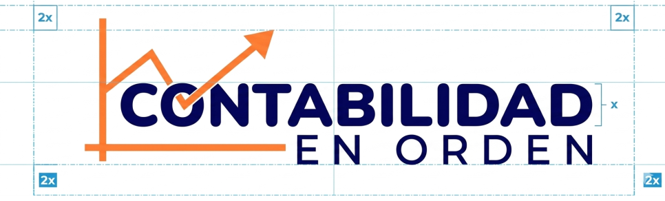
Clearspace
Incorrect Usage

- Do not resize the mark
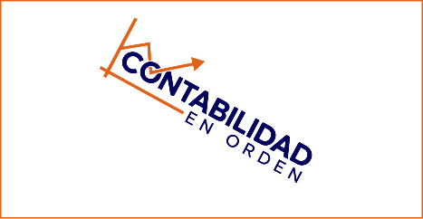
- Do not rotate the logo

- Do not change the color of the mark alone

- Do not apply shadows or effects

- Do not place the logo on busy backgrounds

- Do not crop or cut off the logo
Brand

04 Color
The color palette for Contabilidad en Orden (Accounting in Order) has been designed to convey trust, clarity, and professional approachability. Each shade reflects our commitment to financial order, technical precision, and accessible advice for every client.
Deep Blue:
This color forms the foundation of the brand. It represents the trust, clarity, and stability necessary to make confident decisions. It’s the language of structure, quality, and the peace of mind that comes from having your finances in order.
Orange:
It acts as a balancing element within the visual identity. It brings approachability, dynamism, and a more human way of understanding accounting. It makes complex concepts accessible while always maintaining a high level of professionalism.
Together, these colors create a solid, reliable, and modern identity. This combination allows Contabilidad en Orden to be recognized as a brand that not only organizes numbers but also provides clarity, support, and practical solutions for moving forward with financial security.
Primary Palette
Orange
Hex: #F45F00
Deep Blue
Hex: #ff7a33
05 Typography
The use of a bold, modern sans-serif for the main name conveys structure, control, and confidence, while the lighter, spaced typography in the subtitle introduces approachability and balance. This combination reflects our commitment to bringing order, accuracy, and intelligent systems to every financial process.
The integrated upward line and arrow function as a visual signature—representing growth, direction, and real-time financial insight. More than a graphic element, it embodies our role as a strategic guide, turning numbers into clear decisions and sustainable progress.
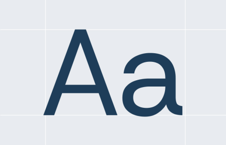
Primary Typeface (Newake Demo) is a bold, modern display font that brings strong visual presence and personality to the brand. Its geometric structure and confident weight communicate authority, order, and control—key pillars of Accounting in Order. It is used for the main logo and headlines, ensuring immediate recognition and a solid, professional impression.
Secondary Typeface (Nunito) is a clean, highly readable sans-serif that introduces balance, clarity, and approachability. Its soft, rounded forms make complex financial information feel more accessible and human, supporting the brand’s mission of translating numbers into clear, actionable insights. It is ideal for body text, digital platforms, and client communication.
This combination creates a powerful contrast: structured yet friendly, strategic yet accessible. Together, they reflect the essence of Accounting in Order—a brand that delivers precision and control, while maintaining clarity, trust, and a human-centered approach in every interaction.
Primary Typeface
Nunito Black
Secondary Typeface
Nunito Regular
Sizing
Contabilidad en Orden
Guarantees consistency and clarity at every point of contact, from financial reports and digital platforms to client communication and strategic advisory, reinforcing our commitment to precision, organization, and trustworthy financial management.
Clear Numbers, Unstoppable Businesses.
From the daily recording of your transactions to the consolidation of corporate strategies, we transform chaos into logical structures, injecting confidence and excellence into every account to ensure your financial peace of mind.
Our comprehensive management system ensures that your information is handled with the utmost accuracy, from cost analysis to year-end closing. We become your strategic partner, ensuring that the decisions you make today are backed by real data and always delivered on time.
Regulatory compliance and tax order are non-negotiable pillars of our service. We believe that transparency is the language of success, which is why we foster open communication with our clients to create a flawless, efficient, and fully controlled financial ecosystem.
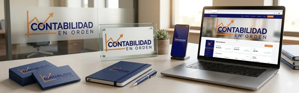
06 Applications
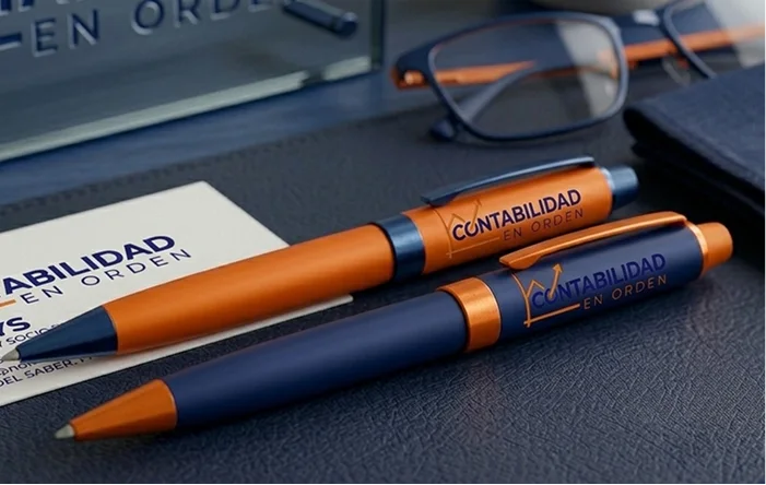
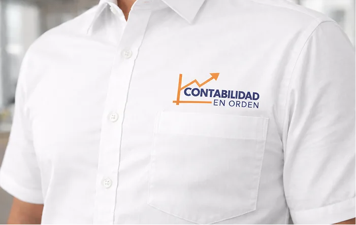
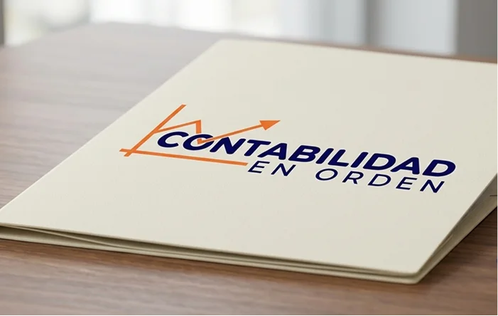
Contabilidad en Orden is built on absolute precision. Our identity is designed to project the security and total control that define each of our consulting services. We don’t just present figures in a balance sheet; we project the empowerment and confidence that come from impeccable financial management, always backed by the technical clarity and professionalism that characterize us.

06 Social Media
The digital ecosystem of CONTABILIDAD EN ORDEN is not just a showcase of services; it is an extension of our analytical capabilities and technical precision. Every publication should be a visual and strategic testament to our accounting methodology.




06 Icons

- Legal
- Privacy
- All Rights Reserved
